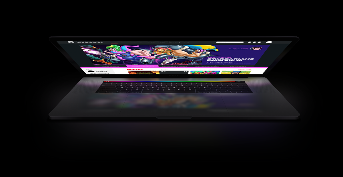
 Well, the process is slow AF but that's my fault entirely, adult life and responsibilityies sort of screw up wth the best laid plans of mice and men (Ba Dum Tss!).
After the first round of feedback and knee-jerk reactions I tightened up the re-design idea a little more based on the points and concerns the comments raised. Though I have one burning question: What is the purpose of Newgrounds in 2019? I'm not questioning it's relevance, as I think the platform is now almsot more relevant than it had been in the last few years (but do correct me if i'm wrong!) Should NG move with the times? Are there any issues with NG at all?
Sidenote: I shit you not, I inclueded Salad Fingers and Starbarians ep3, ironically, back in the time of my first post on December 6th and look at us now. Maybe I can summon animations into existence. If yes, I'd like to order 'The ultimate showdown of ultimate destiny 2' please :)
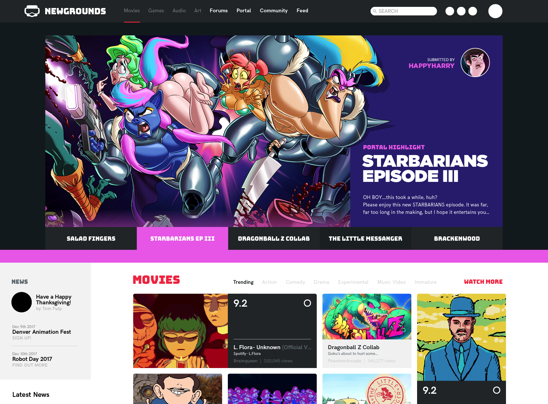
Well, so here's what my idea of the NEWGROUNDS redesign's looking like at the moment. Not super keen on the way the image containers look like at the moment, I'll probably be revising these sometime soon. Other than that...

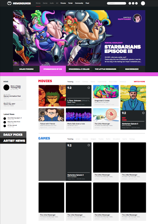
Here's another look at what the full page is looking like.
I have one main theme going on which I think might be an interesting element to look at, even if it gets implemented in the site at the moment; and that is: Different aspect ratios for covers in different mediums. So, the idea is to have all the MOVIE have a 16:9 cover image (similar to movie posters outside a theatre, for example). On the other hand, GAMES will have artwork that's more reminiscent to Video Game cases (so more portrair 3:4 like) whereas AUDIO will have 1:1 artworks that will look and feel more like music/tracks.
Slightly better look here:

In the long run, the idea would be to have more collaboration between creators, so say if i'm releasing a new music track, I might want to get in touch with some static 2D artists to create (or borrow) artwork to serve as art for my track. Same thing with games, etc, etc.
Thoughts? Love ya <3


