00:00
00:00
BoMbLu
Born in 1991, Andrea is (generally) 81kg and is unhealthily obsessed with the colour yellow. He reads books that contain more pictures than words. TL;DR: Graphic Designer, Animator, Illustrator; and passionate about pretty much anything design-related

Andrea Meli @BoMbLu

Age 33, Male

Graphic Designer

MCAST Institute of Art & Desig

Malta

Joined on 10/8/05

Level:
25
Exp Points:
6,566 / 6,940
Exp Rank:
6,916
Vote Power:
6.65 votes
Rank:
Safety Patrol
Global Rank:
28,467
Blams:
88
Saves:
256
B/P Bonus:
6%
Whistle:
Normal
Trophies:
5
Medals:
1,172

I thought it'd be nice to Re-Design NEWGROUNDS.

Posted by BoMbLu - December 6th, 2018


In three year's time I'll probably find myself reading this very post, kicking my self in the ass for not getting this project done after so much time. (End of Prelude)


I called NEWGROUNDS my home for most of my adolescence. Long story short, I owe it to this website for getting me into animation, which lead me into taking desgin seriously and turning it int my career. So, hey, thanks NG! The rise of youtube unfortunately pulled me away from NG and, even though I did frequent it occasionally, I sort of put this site aside for a few years. However, in the last couple of years I found myself frequenting the site on a more regular basis. Maybe the rise in unnecessary censorship was making this inevitable. Plus, the whole Tumbr thing. Enough is beeing said about this and I don't really have much to add to the conversation at the moment.

(Sidenote; i sound like an old fart. If you've gotten this far, cheers babe!)

Around four months ago I dreamt of taking on a new personal side-project: Redesign NEWGROUNDS. Turn it (visually) into a media-consumption-and-contribution powerhouse.

I'm in relatively early stages of the whole design project but I'm tempted to use these posts to documentt this side project, hopefully get feedback and, eventually, finish this silly sideproject already.


Below is what I plan to use as the main NEWGROUNDS icon, a relatively tightened-up Tank Man Head. Thoughts?
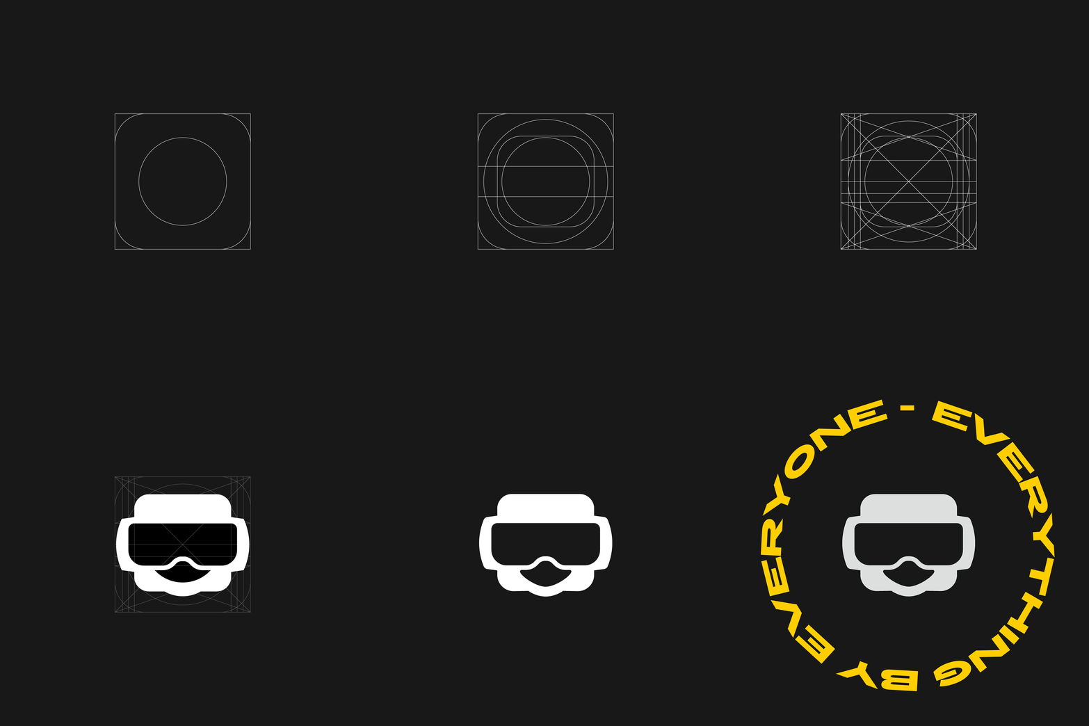

i removed that annoying yellow flash - sorry about that


24

Comments

Awesome!

Cheers!

That flash of yellow gives me a major headache, other than that it seems more simplified and modern, following in the footsteps of most other major sites these days. So yeah, modernization is in effect.

Heh, yep in hindsight that yellow frame might have been excessive, especially for a simple icon buildup.

Possibly helping new users be introduced into the system would be helpful. Explaining some of the ways things happen on this site is kind of confusing to those who aren't used to the system.

Otherwise, I enjoy the remake of the design for the logo. However, I don't feel like making everything clean and flat feels like it goes against the style of Newgrounds. We are a creator community, and having some artsy graphics creates an interesting look to the site. This is more prominently visible in the layout before the update earlier this year.

Also, if you want to help out the site in your free-time, I might suggest talking to the staff about what you can help with or if you were to make an entirely new site layout, ask how you could implement it. Get an idea of what needs to be done, and there will probably be a whole bunch of research into this. Talk to some users as well to see what they would want in the site, maybe set up a site wide survey (somehow). However, you said you went in to design (which is awesome!) so it shouldn't be much of an issue for you.

Just some things to think about. Don't beat yourself up over it though!

Thanks for the input! Yep, to be honest after scribbling out some ideas I took a step back and sort of shat myself when I realised I was stripping the site from all the elements that make the site inherently Newgrounds. One of my early ideas was to strip it down to the bare minimum, which yeah, wont work for the redesign concept.

To be honest, asking the admins if they'd need help never crossed my mind - thanks for suggesting this, I'll try talk to Tom (unless there's someone who's more specific for site design?).

And yes, all your suggestions do make much sense. Introducing new users should be a no-brainer, irrespective of this project I'm working on. I think it should be done, though how, I do not know :P

This seems like an ambitious project! I like the color, the symmetry and... I'm a bit dubious about the figure and text. Figure: a bit too happy? Is that a mouth or a mask? Just seems like something off about that mouth, like it's just not the expression a Tankman makes... and I wonder about the circular text in regard to readability. But I like the essence of it. Cool to see how it evolved there too.

Cheers - yep I probably bit into an idea that's a little too large to chew, but I'll see where I manage to get to. As for the figure, it's mean to be the mouth-opening in the mask, but if it's not too clear it'd have to be revised.

I honestly just plonked the circular text to look all edgy n'shit. The main focus of this little exercise was the head icon itself :)

don't look that good tbh

I think it's far from perfect, so we might be on the same page in reality. What's not looking too good in your opinion?

Maybe a tad more detail to the mouth area because it seems kind of dull without the square jaw or mouth. Otherwise it looks pleasing to the eye

MMM.... yep I think the icon needs a mouth. I thought simple might be better, but I might have simplified it a little too much!

I like where this is going the modrnizing NG's lay out logo and brand however that yelloy flash is annoying and the circular text makes it hard to read especially with that flash.

I killed that yellow frame, apologies for the headache-inducing frame D: Cheers for the feedback!

Hmm yeah, as others suggest, if that's the opening in the mask then a mouth therein might make it all obvious. And get rid of that 'too happy' feel. :P Overall form looking good otherwise!

Will do! Cheers :)

Icon is very nice!

Thanks!

Why not for the icon, but the text is hard to read. Maybe going for square instead of a circle ? Staying in black and white could be an idea as well. I'm unsure, but you've got skills, I'm sure you will find something /o/

Yep, the text is there for decoration more than function at the moment :)

Looks amazing.

Cheers :)

I like how clean and slick it looks. Great work!

Thanks!

What? Why? It's already modern enough. Don't turn it into a media consumption powerhouse. That sounds like a scrolling feed. And I do not want NG to be nust another piece of social media.

In reality that's the challenge I'm giving myself with this project; a fresh take on Newgrounds without turning it into the standard BuzzFeed/Youtube/Vimeo sterile crap.

What do you think are the most important aspects of the Newgrounds look and feel?

I'd avoid warping the text around the head – it's reduces legibility, especially as it appears the text is squished as well. I think it'd probably function better having one logotype with text to the right, and one with text centered below.

I think the tankman itself looks great, but should the colors be inverted? I think it'd probably be more recognizeable if it matched the original design.

Yeah, the text itself is more of an adornment at the moment rather than how I intend the text to work in the final version. Good point about the inverted colours though!

@TheReviewTrickster @BoMbLu well, the logo is actually pretty badass. But that's the thing - you can't have a Newgrounds as a scrolling feed. It doesn't work. There's too much stuff that can't be done like that. There's the forums. Then there's also the fact that a lot of Newgrounds requires a lot of browsing to get to. Too many sections, to put it simply.
This would be an interesting experiment for a Newgrounds app, but not for the main website.

Indeed, I almost forgot how deep the site goes. Maybe it could be a question of finding a new way to navigate the site more efficiently?

He looks a litte too happy I think. I do like the yellow text around it, it looks "oldschool" and it would be cool if you found a way to use it somewhere. Just for fun I played with the face for a sec, they're not carefully done or anything but maybe you'll have an idea while looking at them.
I'll be following this project.

https://www.newgrounds.com/dump/item/28e0d74b0f9fd3fb66cbfdc8b1a7eeaf

Hey! Thanks for testing those two options out - I really dig the version on the left, and think that the guy on the right is the more 'evidently tank-man'! I'll definitely look into fixing mine up ;)

I actually really dig that. Good work man. Real streamlined

Thanks!

The tankman head looks like it has a real weird happy cat mouth going on...it'd look better without that "mouth" part entirely.

Yep, after reading feedback and looking at him again he definitely needs some more work done to him. Have a look at the tests @Dunso worked on :)

The head looks weird, but I like what you're trying to do.

Cheers ;)

I don't think I'm ready for this yet. I just got used to the old logo.

Do you think the Tank itself might be a better visual icon for NG?

More Results